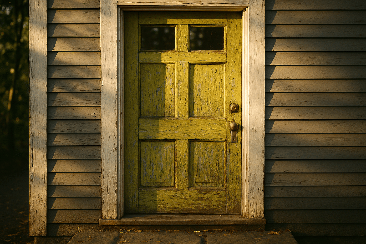
The Divisive Front Door Color Sparking Debate
Outline
– Section 1: The Color Causing Commotion—Why a Single Hue Feels So Big
– Section 2: The Enthusiast’s Case—Personality, Visibility, and Joy
– Section 3: The Skeptic’s Case—Resale, Rules, and Practical Realities
– Section 4: What Limited Data and Market Signals Suggest
– Section 5: A Calm Path Forward—How to Choose, Test, and Apply with Confidence
Introduction
The humble front door has become a lightning rod for design opinions, and no hue ignites more neighborly chatter than a high‑visibility yellow‑green—often nicknamed chartreuse. One swipe of that electric color can tilt a façade from reserved to radiant, from quiet to conversation starter. Its vibrancy intersects with psychology, architecture, neighborhood norms, and the very practical realities of maintenance and resale. In an era when curb appeal begins online and a house’s first impression is a smartphone thumbnail, the front door functions like a headline. The question is not only aesthetic—Do you like it?—but strategic—What story does it tell, and to whom?
The Color Causing Commotion—Why a Single Hue Feels So Big
Walk down a street lined with tasteful neutrals and then encounter a door painted in a zesty yellow‑green. You notice it—instantly. This hue sits between green and yellow on the color wheel, brimming with energy and high chroma. Because the human eye is especially sensitive to green wavelengths, the color feels unusually assertive in daylight, more saturated to our perception than many blues or reds at comparable intensity. Exterior design amplifies that effect: the door is a small but centrally positioned rectangle, framed by trim, glass, and shadow lines that funnel attention straight to it. The result is a kind of architectural exclamation mark, whether you intended a friendly hello or an emphatic headline.
Color psychology helps explain the split reaction. Yellow leans optimistic and extroverted; green suggests freshness and growth. Fuse them at high saturation and the blend can read as playful, even cheeky. Yet this same brightness can feel restless to those who prefer calm cues at a home’s threshold. Cultural references also shape perception. In some contexts, greenish doors nod to gardens, kitchens, and markets. In others, the neon edge conjures fashion statements or nightlife signage—spirited to some, too loud to others. The setting magnifies the message: a farmhouse with natural stone reacts differently to the hue than a modern stucco volume with crisp, minimal lines.
Architectural compatibility is crucial. Consider how undertones play with fixed elements. Warm, creamy masonry absorbs the color’s yellow and softens it; cool gray siding amplifies the acid note. Shadow orientation matters, too. North‑facing entries often mute chroma, making bright choices feel slightly more complex, while south‑facing doors can look hotter and flatter at noon. Even sheen changes the read: gloss heightens reflections and perceived intensity; satin feels quieter and typically shows fewer surface waves. What seems like the same paint chip at the store can morph wildly outdoors.
Three forces make this hue feel bigger than its square footage:
– Visual salience: high chroma against neutral cladding commands attention.
– Symbolic weight: the door is a threshold, a social signal of welcome or reserve.
– Photographic impact: camera sensors often punch up greens and yellows in bright light.
When a single component carries that much semiotics and optics, it is no wonder a neighborhood chat turns into a design seminar.
The Enthusiast’s Case—Personality, Visibility, and Joy
Supporters of a vivid yellow‑green front door argue that homes can—and sometimes should—broadcast personality. A house is not a museum piece; it is a living backdrop for daily rituals. A spirited door can serve as a small act of hospitality, a wink that says, “You found us—come in.” Personal expression aside, practical upsides abound. Wayfinding, for instance, is genuinely easier. Delivery drivers, guests, and ride shares identify the entry point at a glance, particularly helpful on tree‑lined streets or where several façades look alike. In rain or twilight, the saturated hue remains legible without relying solely on exterior lighting.
Designers who favor bold entries often lean on balance strategies that keep the whole composition intentional rather than loud. They might pair the color with restrained, matte siding; deepen the trim to charcoal for contrast control; or echo the hue subtly in planters. The idea is to let the door sing lead while the rest of the band holds a steady rhythm. Consider a mid‑century ranch with horizontal lines. A bright door can punctuate the long elevation, giving the eye a starting point. On a narrow townhouse, the door can double as a friendly landmark, easing the verticality with a note of play.
The joy argument is not trivial. Color influences mood and habit formation. People often report that a cheerful entry nudges them to tidy the threshold, care for hardware, and refresh seasonal accents. That micro‑motivation adds up: a doorway that delights its owner tends to be maintained, and maintenance is the quiet hero of curb appeal. Beyond emotion, there are safety and accessibility benefits. A high‑contrast entry improves visibility for visitors with low vision. While formal accessibility standards reference luminance contrast more than hue, practitioners note that saturated accents can aid spatial orientation when paired with adequate value difference between door, trim, and siding.
The enthusiast’s toolkit often includes:
– Sampling medium swatches directly on the door, seen morning, noon, and dusk.
– Choosing satin or low‑sheen finishes to lower glare while preserving vibrancy.
– Tuning undertones with adjacent elements—warm metals, natural wood, or charcoal.
– Repeating the color in small accents to knit the composition together.
Put simply: for those who crave a daily spark of delight and a handy landmark, the lively yellow‑green can feel like a compact upgrade with an outsized smile factor.
The Skeptic’s Case—Resale, Rules, and Practical Realities
Opponents rarely object to color in principle; they question fit, longevity, and market consequences. The resale conversation surfaces quickly. While exterior paint is reversible, many buyers filter listings in seconds. If the door color dominates the first photo, a subset of shoppers may swipe past, especially when they struggle to imagine alternatives. Skeptics note that a calmer entry photographs broadly and allows prospects to project their preferences. In slower markets, shaving off even a small slice of potential interest can feel risky. Add homeowners’ associations to the mix: some communities restrict high‑chroma exteriors, and the line between “fresh” and “fluorescent” in rulebooks can be ambiguous.
Maintenance is another practical hurdle. Fluorescent or very bright organic pigments can fade faster under strong UV exposure than earthier, inorganic pigments. South‑ or west‑facing doors bear the brunt, and coastal air compounds wear. A high‑gloss finish, while dramatic, will spotlight every dent, brush mark, or seasonal expansion line in wood. Steel doors warmed by direct sun may reach temperatures that stress certain coatings, leading to micro‑blisters or premature chalking if prep and product selection fall short. The upshot: keeping a neon‑leaning hue crisp may require more frequent cleaning and periodic refreshes to avoid looking tired rather than spirited.
Compatibility with architecture and materials matters. On ornate historic façades, a loud door can collide with intricate trim, making the composition feel fragmented. On a minimalist box, the same color can read as a confident accent. Siding undertones are unforgiving: cool blue‑grays push the color toward acid; warm taupes can mellow it. Stone with heavy variegation may compete visually, especially if both carry strong yellow notes. Even landscaping plays a role—chartreuse foliage nearby can make the door feel less singular, whereas purple‑leaf plants can create a pleasing complementary dialogue.
Practical concerns skeptics raise include:
– Rule compliance: verify community guidelines on chroma and reflectance.
– Durability: prioritize UV‑resistant formulations and diligent surface prep.
– Reversibility: plan for an easy shift to a quieter door if market timing changes.
– Context: test against fixed elements—roofing, masonry, gutters—under live daylight.
In short, the caution is not anti‑color; it is pro‑coherence, pro‑maintenance, and pro‑market agility.
What Limited Data and Market Signals Suggest
Color debates crave clean numbers, but the data landscape is nuanced. Analyses of property photos and sale outcomes over recent years have occasionally noted that darker, saturated neutrals on doors—think near‑black, charcoal, or deep navy—tend to photograph with gravitas and sometimes correlate with modest price premiums. High‑chroma outliers, by contrast, often generate polarized reactions: they earn strong enthusiasm from a minority and hesitation from others. Importantly, these are correlations, not prescriptions; overall maintenance, neighborhood norms, and architectural quality carry far more weight than a single paint choice.
Consumer behavior online offers additional clues. When potential buyers scroll through listings, small thumbnails do disproportionate work. A bright yellow‑green door can lift click‑through in some cases because the image stands out, but the same trait can also inflate bounce rates if the vibe clashes with a viewer’s taste. Real‑world scenarios play out like this: the door hooks attention; subsequent photos either confirm thoughtful design and good upkeep—or they reveal mismatches, and attention curdles into doubt. Agents frequently report that neutral entries cast a wider net, while distinctive hues can function as a filter that attracts aligned buyers and quietly repels others.
Surveys of homeowners and renovators commonly suggest a preference for cohesive exterior palettes anchored by body, trim, and a measured accent. Among those respondents, bold doors win favor when they clearly harmonize with undertones and surrounding materials. The color’s success rate appears to rise on newer or intentionally modern homes, and to dip on facades with complex historical detailing unless the rest of the scheme is tightly edited. Climate also shapes outcomes. In sun‑intense regions, even well‑formulated bright paints age sooner, narrowing the maintenance window before a refresh is advisable.
Translating signals into decisions means embracing nuance:
– Read the block: if several nearby homes already feature colorful entries, your door joins a local language rather than shouting over it.
– Image strategy: if listing soon, photograph both a bold and a quieter door to test audience response before committing.
– Lifecycle planning: budget for cleaning, minor touch‑ups, and a possible color pivot aligned with market timing.
The measured takeaway is that a bold yellow‑green door can be an asset when it completes a coherent composition and a liability when it fights its context. Data does not crown a single winner; it simply reminds us that taste meets timing and technique.
A Calm Path Forward—How to Choose, Test, and Apply with Confidence
If the lively yellow‑green calls your name, you can honor both joy and prudence with a clear plan. Start by grounding the choice in your home’s fixed features—roofing, masonry, siding, and metalwork. Identify undertones: if your roof reads warm brown and your siding leans sandy, a slightly olive‑tilted chartreuse may feel integrated; if you are surrounded by cool grays, you might soften the intensity or deepen the value to avoid an overly acidic impression. Consider light reflectance value (LRV), which predicts how light or dark a color appears. Lower LRV versions of the hue sit closer to mossy notes and often feel more architectural, while very high LRV variants skew neon under midday sun.
Process reduces regret. Tape up large, hand‑painted swatches—two coats, on primed poster board—and view them over several days. Look at them beside the actual door hardware and trim. Photograph the samples in morning shade, high noon, and at dusk; let your camera show you how sensors exaggerate or mute the hue. Decide on sheen with intent: satin or low‑lustre finishes typically balance cleanability with forgiveness for surface imperfections; semi‑gloss increases pop but reveals more texture. If the door is wood, sand to a smooth plane, spot‑fill dings, and use a high‑quality primer compatible with the topcoat. For steel and fiberglass, clean thoroughly, de‑gloss glossy factory layers, and use the specified bonding primer.
Application tips that pay dividends:
– Remove hardware and weatherstripping where feasible; label screws in a small bag.
– Lay off brush marks in the final pass, and tip out edges to avoid ridges.
– Keep a wet edge; if rolling panels, back‑brush lightly for uniform texture.
– Respect dry times between coats; rushing traps solvents and dulls sheen.
For homeowners keeping one eye on resale, there are reversible strategies. Paint only the exterior face in the bold hue and keep the interior of the door quieter. Choose accent pieces—planters, a porch stool, a doormat with subtle green notes—to echo the door and make the choice feel deliberate rather than impulsive. If you may list within a year, store a quart of a neutral door color and the primer you used; a weekend is usually enough to pivot. Finally, sanity‑check with neighbors you trust, not for permission but for context. If three porches nearby already carry playful colors, your entry becomes part of a friendly rhythm. If every façade leans muted, consider a slightly deeper or softened version—still spirited, just more attuned to the chorus.
Conclusion for the practical romantic: let the door carry a note of delight, but tune it like an instrument—by ear, by environment, and by maintenance plan. When expression meets craft and context, even a famously divisive color can feel like a confident hello rather than a shout.


